Vibrant Visions Co. is a queer-owned company that plans and produces editorial shoots celebrating vibrant and diverse love.
The creative directors of Vibrant Visions Co. prioritize inclusivity and diversity in their styled shoots, and want to make sure everybody (and every body!) is able to see themselves in the wedding industry.
Abigail and her partner Kayla state, “Looking at examples of queer and gender non-confirming wedding celebrations, we felt frustrated that things still seemed to fall into the binary. As we moved further from tradition, we got to see gender expression and individuality thrive.”
They came to me in need of an intentional visual identity for their brand. One that embodied their core values of inclusion, nonconformity, representation, and diversity.
Their brand keywords include:
- Queer
- Non-traditional
- Modern
- Bright
- Clean
- Organic
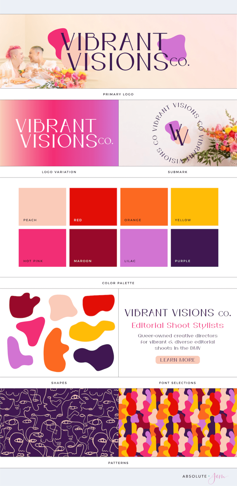
Although “modern” was one of their keywords, they didn’t want harsh lines. So I went with typography and shapes in their primary logo that had a more fluid, flowing look—along with a dynamic color palette with high contrast so they’d have plenty of ADA-compliant colorways.
And let’s not forget to mention the brand patterns and gradient! The patterns also follow the fluidity of the branding, and incorporate lots of “forms” that are reminiscent of all the different shapes, colors, and identities that make up humanity.
Here’s a peek at their boldly colorful and all-embracing brand identity:


I’m so honored to play a part in this project and can’t wait to see @vibrant.visionsco blast open the styled shoot industry as we know it.