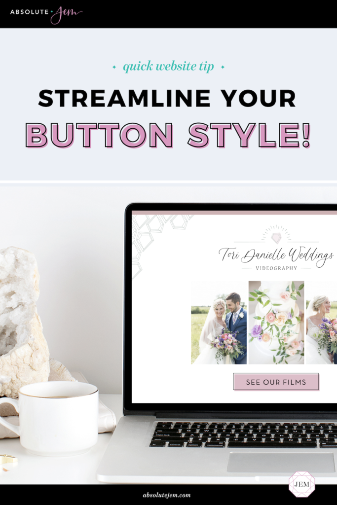
Want to instantly make the calls-to-action on your website more effective? Streamline your button style!

Here's an interesting thing about web design: You "train" your visitors how to use your site. Consistent styling throughout your website helps visitors intuitively navigate through it.
A prime example of this is your button style. Calls to action on your website come in the form of a rectangular or pill-shaped button that says things like "Get in Touch!" or "Sign Up!".
It's SUPER important to give these buttons a consistent look, so you can train your visitor's eyes to find them – and train their fingers to click them!
For example, make all the buttons on your website green rectangles. That way, on every page, your user will automatically know what they're "supposed" to click on.
If your buttons are all sorts of random shapes and colors, a user's eye may just skip right over them. But if they're all eye-catching and consistent? A user will be much more likely to spot them and click!
And here's the thing – button styles don't have to be boring! Typical button size is around 60px high and typically rectangular or pill-shaped, but get creative with the colors, styling, outline, or hover effect to make your buttons really stand out.
Take a look at your website and make sure your buttons are consistent across all pages. It's a quick and easy way to boost your website's conversion rate!