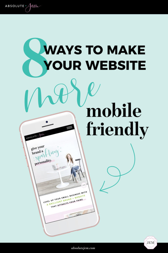
Hard truth: A mobile-friendly website is a non-negotiable. According to Google, over half of all internet searches come from a mobile device. We’ve officially crossed the threshold of mobile over desktop—which means you gotta start prioritizing how your site looks across different devices.
What’s more? Google now uses “mobile-first indexing”—meaning the mobile version of your website is what’s being primarily indexed and ranked. As a result, mobile-friendly websites show up higher in search results!
Mobile-friendly websites are exactly as they sound: Websites that look and function just as beautifully on a desktop or laptop computer as they do on a mobile device, like a smartphone or tablet.
So how do you ensure your website is mobile friendly? Follow these 8 best practices to give your mobile users a delightful browsing experience.

Speed Up Your Site With Optimized Images
Did you know that almost half of all visitors will leave a mobile website if the pages don’t load within 3 seconds? And unoptimized images are usually the worst offender when it comes to slowing down your site!
Images across your website should be optimized to reduce their file size. This means photos should be no larger than 1500px–2500px on the longest side, with a file size in the KBs...not the MBs. Note that JPG extensions are usually the smallest file size (as compared with PNGs or GIFs). Compressed images allow for speedy load times over mobile connections—strengthening both your user experience and your SEO.
Size Up Your Buttons, Links, and Form Fields
Keep in mind that mobile users aren’t clicking around your website with a mouse—they’re using their thumbs! You need to size up your calls to action accordingly. Be generous with the sizing of CTA buttons and put plenty of white space around important links.
For your website’s contact form, limit the amount of typing required to make the mobile experience easy-breezy. This may include the use of radio buttons or dropdown options to save space and keep type-in fields to a minimum.
Get Strategic With Your Mobile Menu
Your mobile menu should be sticky to the top of the user’s device; meaning that as they scroll through your web pages, they can always access the mobile navigation at the top of their screen. Instead of a row of links at the top, use a hamburger menu ☰ that opens and closes to save space. And again, put plenty of cushion around the links in your mobile menu so it’s optimized for thumb clicks!
Keep Fonts at 14–16pt Minimum
This is the absolute minimum size for your body font. Title text and headings should be even larger. Anything smaller than 14–16pt is all but impossible to read on a mobile device. Don’t assume your users will simply flip their phones horizontally in order to read your small text. Treat the vertically-oriented user experience as the top priority, and make it easy to view your website without having to zoom in.

Stick With Short Blocks of Text
Break up big blocks of text into concise, easily-digestible (and skimmable!) blocks. I don’t necessarily recommend trimming your SEO-rich web copy for mobile, since remember, Google is indexing and ranking the mobile version of your site. But I do recommend breaking up blocks of text with images, or at least formatting with headers, bolding, or bullet points.
Stack Your Footer
Footers are an incredibly important—yet often overlooked—part of web design. Pay close attention to how your footer looks and performs on mobile. Stack all the important elements and spread things out so links and social icons are clickable, email opt-ins are showing up correctly, contact information is clickable, etc. etc. I also highly recommend putting a “Back to Top” button on your mobile footer so users can easily pop back up to the top of the page without having to scroll for dayyys.
Make Contact Info Clickable
For a great user experience on mobile, you want your phone number, email address, and physical address to be “clickable”. This means that clicking on your phone number or address triggers a call prompt, opens up the Mail app, or provides directions via the Maps app.
Test, Test, TEST!
Last but certainly not least, it’s crucial that you take the time to thoroughly browse your website on a variety of different devices. Do it on your iPhone, your iPad, your friend’s Android or Surface Pro (and even on a variety of different browsers, like Chrome, Safari, and Firefox). If you don’t have access to several different mobile devices, don’t stress! You can preview your site on mobile via View > Developer > Developer Tools in the Google Chrome browser.
You can also type your URL into Google’s Mobile-Friendly Test to see how each page scores.
◆
This all boils down to creating a silky-smooth mobile experience.
When we’re on our phones our patience for endlessly scrolling web pages, or suuuper slow load times, or confusing interfaces, or teeny-tiny text is slim to none. Creating a mobile-friendly website will help with conversions, make you look modern and savvy, and help you rank higher on Google.
So what are you waiting for? Go forth and optimize!