Your website is primed to convert. It's strategically designed, full of fabulous copy, and bursting with personality and visual eye candy. Your ideal clients just can't wait to jump on over to your contact page to submit an inquiry through your form!
But alas, your contact form is dry, technical, and boring. Your ideal clients may not mind (or even notice at first!) as they fill in the normal "Name" "Email address" and "Message" fields... Then they hit the "Submit" button and an equally dry "Thanks. Your form has been submitted" pops up.
What a womp-womp moment!
Here’s the thing: We put so much thought into the copy and design of our websites that we should be equally concerned with carrying that user experience through to our contact form! This is the final piece of the puzzle—the thing that connects you with potential clients. I propose we rethink our contact forms entirely to carry the same warm-fuzzy experience from the home page all the way through to the inquiry.
Here are 9 ways to optimize your website's contact form—and get more leads!

1. Put an attention-grabbing headline.
Instead of the same old boring "CONTACT" at the top of the form, hook your users in by displaying a strong-yet-inviting call to action. Something like, “Let’s connect!” or “Questions? I’m all ears!” is a much more warm and friendly way to encourage users to get in touch.
2. Make your fields more conversational.
The goal is to make your contact form an extension of your voice. And if you had your ideal client standing right there in front of you, would you simply state "NAME" if you wanted to know what their name was? No! You're not an ice-cold robot, so your contact form shouldn't sound like one. Asking real questions like "What's your name?" as the field prompt makes the form more engaging.
3. Keep it simple.
Yes, we want to be more conversational. But no, we don't want to be long-winded. Our forms must be clear, concise, and actionable to be effective. Only ask for the information you absolutely need. The longer the form, the fewer the number of people that will fill it out. Make the "barrier" to contact you as low as possible by keeping the form brief and easy to answer.
4. Optimize for mobile.
Don't just think of your contact form in terms of desktop—because more and more users will be accessing your website (and filling out your form!) on their mobile devices. Do what you can to make the mobile experience seamless. This may include the use of radio buttons or dropdown options to save space and keep typing to a minimum.
5. Make important fields mandatory.
At the very least you need their first name and email address to have any sort of meaningful communication beyond the initial inquiry. Beyond that, are there any pieces of info that you absolutely need to know in order to have a meaningful exchange with this lead? Make those required fields.
6. Use your imagination.
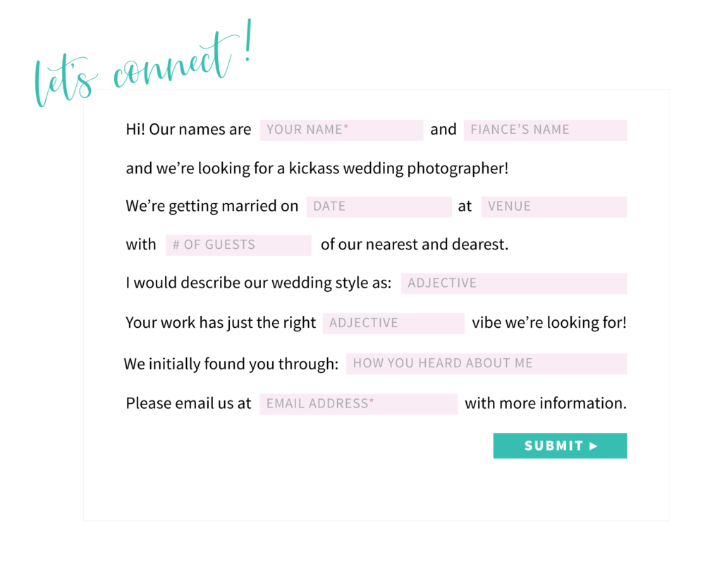
There are a lot of really playful ideas out there for contact forms! I've seen everything from interactive Mad Libs-inspired forms, to ones that look like you’re filling out a postcard, to putting hilarious options in a dropdown menu. Getting creative with your contact form will attract your ideal clients and set you apart from your competitors. For example, how fun would this contact form be for an engaged couple?

7. Keep your submit button simple.
"Submit" or "Send" may not sound all that exciting, but boy are they clear. Your potential client knows exactly what will happen when they hit that button...and that's precisely what you want with your call to action. So while I’m a huge advocate for injecting personality into your web copy, don't get too far-fetched with the CTA text on your button.
8. Zsush up the "success" message.
Once your potential client fills out all those charming fields and hits the button to send off their form, what's next? A “success” message should automatically pop up to replace the form. This message assures the user that their form has been submitted, and gives them an expectation as to when they’ll hear back from you.
But let’s take it a step further: Is there anything of value you can provide here? Or something fun you can do to celebrate this new lead? Along with your success message, consider including a few free tips, links to helpful blog posts, or a downloadable PDF resource to tide them over until they hear back from you personally.
9. Have an automated reply at the ready.
You should personally respond to every lead within 1 business day. But we all want immediate gratification—which is why you need an automated email to be sent to the user immediately after they hit the submit button. This is similar to a success message, but it goes directly to their inbox and further establishes the fact that you care about their inquiry.
With this triple hit of the success message, automated reply, and personal email response, you’re showing your potential clients that you’re incredibly responsive—which will go a long way when they’re making their booking decisions.
Bonus Marketing Tip: Always ask "Where did you hear about me?" or some variation of this question on your contact form. It's important to keep a log or spreadsheet of these responses so that you know where these potential clients are finding you! I recommend pairing this method with a web tracker like Google Analytics to get a really full picture of which marketing platforms or referring sources are working for you.
◆
Think of every click on your "Submit" button as a cause for celebration. How can you celebrate each user who fills out your form and clicks that button? Personalizing this experience on your website will reinforce the warm, fuzzy feelings your potential clients associate with you and your business.
Ready? Go level up those forms!