As a brand designer, creating a mood board is one of the most important steps of the branding process. Because for me, it not only sets the tone, style, and colors for the brand—but also informs almost every other design decision along the way.
Big deal, right?
A mood board is simply a collection of images, text, patterns, texture, etc. put together in a cohesive collage.
And besides setting the tone/style/colors and overall visual direction, the process of creating a mood board sets the stage for a successful branding project in the following ways:
- It gives the designer a glimpse into what the client is envisioning for their future brand
- The creation process provides a fun, interactive way for the designer and client to collaborate
- It translates the feelings we want a brand to convey into visuals
- It serves to organize the overwhelming number of ideas we may have about a brand’s design
A mood board can be physical (helloooo magazine clippings!), but since we live in the age of Pinterest we’re going to cover putting together a digital mood board. Although I do love me the smell of glue sticks. Weird.

Get some clarity
Before you dive headfirst into Pinterest you need to do some homework. Have your ideal client description and brand keywords right there in black & white in front of your face. Sit back and REALLY think about your brand keywords. What feelings do you get from thinking about them? Visualize your words, and think about what each word looks like to your ideal client.
For example, if one of your brand keywords is "fancy" – what does that look like to your ideal client? Is it a black sequins dress with chandelier earrings? Or is it dinner at a five-star restaurant...or bold red lipstick...or a bottle of champagne...or a vacation on a mega yacht?
Have these general themes and images in mind first, and then head on over to Pinterest.
Get to pinning
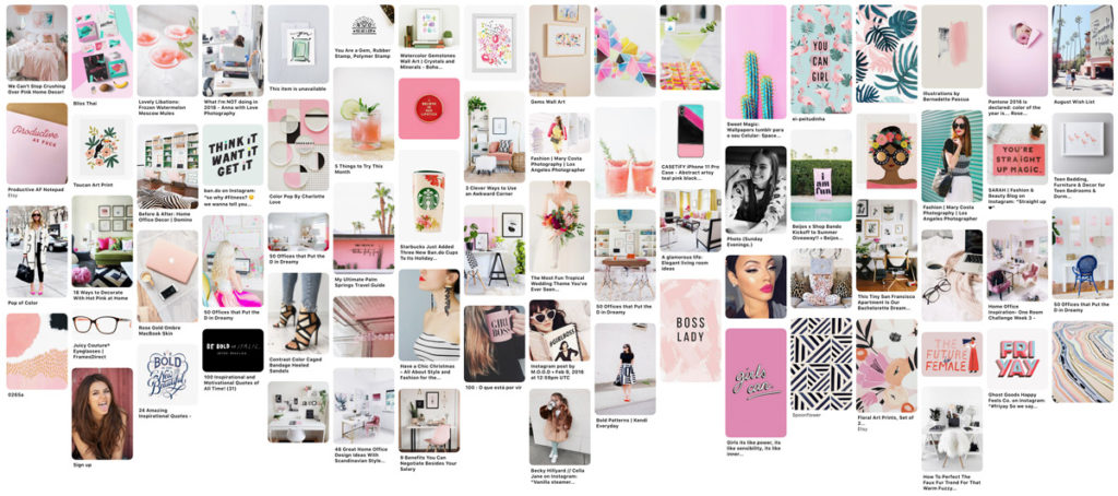
I tell my own clients to pin at least 30–50 images, but encourage them to pin as much as possible. I love when I get a good, juicy Pinterest board with 75–100 images. Now that might sound overwhelming, but I’m here to walk you through the narrowing down process. So don’t be scurred.
Also, don’t think you have to stick to Pinterest to find inspo. Branch out! Go to your favorite stationery brand websites like Rifle Paper Co., that colorful lifestyle blog you love, home décor sites like Magnolia, or even funky fashion sites like Betsey Johnson!
Don’t overthink it
Keep the feelings of your brand in mind and look at images through your ‘ideal client’ lens, but beyond that, don’t limit yourself. Don’t only pin certain colors. Don’t stick to certain pre-conceived style notions. Don’t think you need to pin logos or packaging or fonts. Pin literally anything and everything that strikes you.
It could be a random photo of a cute dog, or a big tower of cupcakes, or a super cool wrapping paper print...who knows! You may not even know what you like about it or why it makes you feel a certain way. That’s okay, because the magical mood board has a way of making sense of these things.
Tip: If you don’t want anyone to see your brand inspiration, you can make a “secret board” in Pinterest to keep things a surprise.
Walk away
I like to walk away for at least a few hours to “forget” everything I’ve pinned, and then come back to my Pinterest board with fresh eyes. This helps me better process all of the images in front of me, and gives me a clearer picture of the general, overall themes beginning to form.
See the full picture
Now I want you to save every single image you’ve pinned to a folder on your desktop. On my iMac, I’m able to open up my Pinterest board and simply drag and drop the images to a folder. But you can also right click on each pin to “Save image as...”
Once you have all your pins saved, the next step is to open up your design software. I use Adobe Illustrator, but Canva works, too! Open up a fresh new artboard/canvas, and literally dump every image you've pinned onto that board. Take a step back, and try to get an overall sense of what’s tying this full visual picture together. What are the most consistent common threads? Is it that deep blue color? The Art Deco-inspired patterns? The scripty fonts? The feeling of sassiness or silliness or joy?

Narrow it down
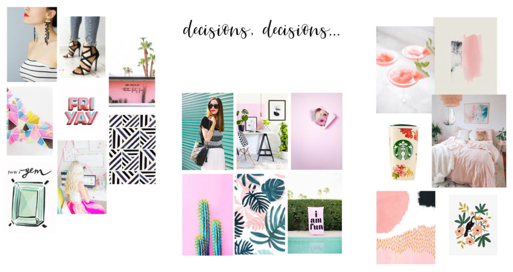
Once you begin noticing patterns, start the process of narrowing things down. The easiest way to do this is by removing any glaringly inconsistent images. That garish yellow image does NOT jibe with the soothing blues and greens in your other images. Bye Felicia. That cluttered image of a bedroom has too much going on to really be useful. See ya.
Begin grouping together images that work really well together. You’ll begin to find your favorites, and to see where your brand direction is headed. Once you have a small, cohesive grouping of images you love, keep building on that. Work it like Play-Doh. Weed out the duds, and keep the images that not only go together, but also make you swoon.
Walk away again
This is a process, okay?? Walking away from a project is the best way to clear your mental cache. Once you come back to the images, you won’t be as cross-eyed and will see things with so much more clarity and direction!
Do your “keeper” images still mesh well with each other? Maybe now you can delete that one image you were on the fence about. Or decide you could use one more image with a specific color, vibe, or shape. This is where you make those all-important keeps and cuts, and whittle your imagery down to the winning picks!
Tip: Choose images that are clean and not overly cluttered, with some design inspiration that can inform your brand collateral. For example, the picture of the woman with the black-and-white striped shirt can be the inspiration for a black-and-white striped pattern for your branding. Or the chunky, shadowed font used in the FRI-YAY graphic can inspire a logo with a bold, 3D typeface. You want to love the images you choose, but you also need them to be useful and inspirational to your brand design.

Pick your colors
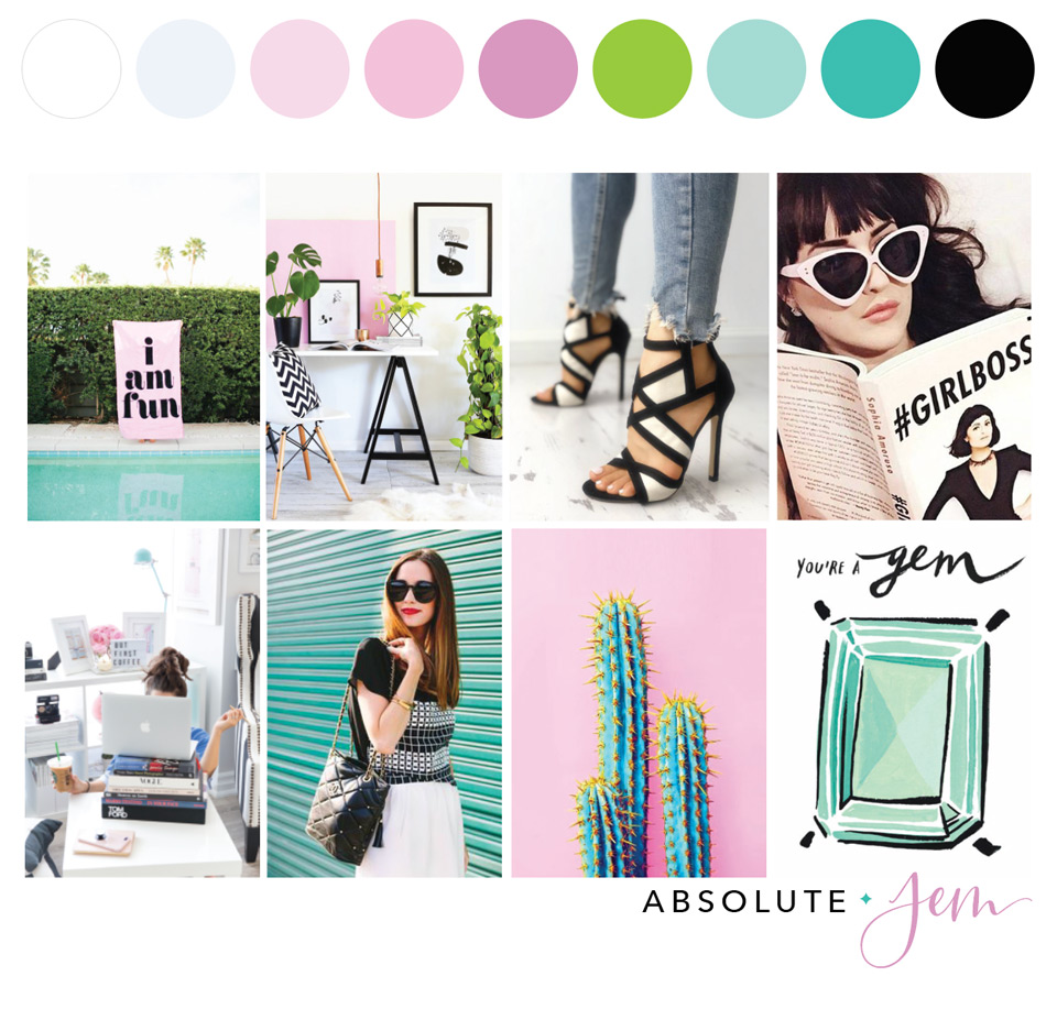
The last step is to “pick” your favorite colors from your mood board with a color picker. A color picker looks like a tiny eyedropper icon, and can be accessed in Adobe Illustrator or with a browser plugin like ColorZilla, which works with both Chrome and Firefox.
Click the colors in your mood board that resonate with you most, and that coordinate well with each other. I recommend choosing at least 3–6 colors for your brand color palette. This may sound like a lot, but in my experience having a good mix of light, medium, and dark tones keeps your brand versatile and allows for a good amount of contrast. If you’re anything like me, you'll get bored and feel quite limited if you only have 1–2 colors to work with.
Note the HEX codes for each color you pick. This "code" is key to keeping your colors consistent across all your designs. Don't just eyeball it! Each color has its own 6-digit code that begins with a pound sign (for example, the teal in my brand is #3FBEB1). By using hex codes in Illustrator, Canva, Showit, and any other design software or website builder you use, you'll be marvelously matchy-matchy across all your branding. Swoon!

And there you have it! You’ve successfully narrowed down a huge hodgepodge of imagery into a cohesive mood board with consistent feelings, colors, and styles.
This is always my very first step in designing brands. I then use this mood board as the jumping-off point to inform the design of the logo, its variations, and literally every other brand element. The mood board is SO key, so make sure you love it!